Sunday, October 07, 2007

Silverlight

So over the past couple of weeks I have been messing around with making my first Silverlight application. I say application but really it is a just a simple hero banner which I had previously knocked up in Flash in a day. What happens is 4 images fade and scale between each other while a window expands center stage from the _yscale and text dynamically appears with a typewriter effect. There is also a button that appears on rollover with a URL programmed into it. So I got Parallels running on my mac (which incidentally is great) and had Expression Blend 2.0 (September Preview) installed which is what you need to create a Silverlight package. So Silverlight is actually the plug-in much the same way the Flash Player is a plug-in to your browser. It is Expression Blend that is the designer's tool to create the Silverlight application just as Flash 8 or CS3 would be used. I checked out the 'getting started' tutorials on Lynda.com which is well worth a look and then got started.

My overall impression of Blend is that it is similar to After Effects. The look and feel is that of dark panels with use of fixed or floating panels that can be minimized easily. It also makes use of sliders in the form of click and drag (left or down for minus amounts and right or up for plus amounts). To start building the Silverlight package you need to collect all your assets together which have to be added to the package in the same sort of way that you'd add say an image to your library in Flash. All well and good so far. So I managed to drag an image to the stage and with Expression Blend there is no need to create a movie clip and so I was ready to start animating. What you have to do first though is to create a 'timeline' which seems counter-intuitive coming to it from the Flash world. Oh and you have to watch out for whether the timeline is 'recording' or not as this will track any movement or changes. This became very tiresome very quickly. But I did manage to eventually get two images to scale and fade between each other. You have to set up key frames where you want the animation to be and off you go animating. Blend is a time based animation package which is ok but not very precise, I think I prefer animating over frames. What I did find weird was that there seems to be no way to resize an image to an exact pixel point. The only way I could manage to resize images was with the handles and then you had to resize to a 3 decimal point of a pixel which seems very odd.

Now I felt quite pleased with myself that after a day's work I had scaled and faded 4 images between each other and made the window pop open and closed at various points. By the way, Silverlight does not pixelate your images when scaling which is a problem flash has long had and is only overcome by using the BitmapData class. So my first major obstacle with Blend was how to preview the work. In Flash you would test the movie and it would appear in the stand-alone player or you could view an HTML page to see how it views in your browser. With Blend you supposedly press F5 and it tests your movie for you. But for me this did not work. It seemed frozen on the first frame. After an extensive internet search I found some xaml code (xaml is the new programming language for Blend and Silverlight and is very XML based) that would autoplay the animation on load. Now I thought that the onload command was supposed to be built in? Anyone coming at this from a non-code background is going to be very frustrated very quick. It took a bit of hacking but eventually I got the XAML to work and my animation started to play.

And so to frustration #2. When viewing the animation in Firefox the dimensions were wrong. I had set my document properties within Blend and the XAML seemed right too. So what was the problem? I decided to get my hands dirty and look at the javascript and this is where the problem lay. It seems that Blend did not create the browser page properly so by changing these width and height properties I was on my way. Although this does seem a very basic thing and one that will again frustrate many people (myself included). Leading me to think that perhaps this version is not ready for public release yet.

Frustration #3. Each time I previewed my work in Firefox it asked me whether I wanted to reload the project as it said it had been modified outside of Blend. Clearly it hadn't but I did reload it each time. This seemed weird and the major issue I had with this workflow was that it reset your page settings and layout to the default which is not cool because the animation layout is not the default setting. The Lynda tutorial recommended allowing the reload.

So my next task was to create the text. Now I wasn't going to try anything as complicated as coding a typewriter effect, I was simply going to get my text to fade in and out. So I set up my text box and typed the copy in and then I went to select my font. WHAT??? Only 9 fonts available. That can't be right. This is for a client and they need a specific font. Grrrrr. Back to the online forums. No help there. So I pulled in some resources from work and eventually got some tech support from a person who worked on the Silverlight program over in the States. He said that Silverlight only supports 9 fonts. Really? Well I suppose the same is true of Flash but you can still design with other fonts and Flash will embed them for you or you can do it yourself. Not so with Silverlight. The only solution was about 20 lines of javascript that the guy sent me. And to be honest it was way over my head. Blend creates 3 javascript files and I had no idea where to put this code. This seems crazy to me and really frustrating. So this is where my project died.

I'm off to Silverlight training for the next 3 days so I plan to ask a lot of questions then. I am required to learn this software package as the client is demanding Silverlight applications in the near future. But my advice to any fellow Flashers looking to learn another software package is hold off on this one. It is simply not ready. It is not designer friendly yet. There is potential for it being ok. But it is years behind what Flash can do and you will need to learn new code to get it to work. But then again this is Microsoft and they will be pouring a lot of resource into this project in the future so be sure it is set to challenge Adobe. But for now just sit back and wait.

Saturday, September 29, 2007

gondry motorola ad

I was delighted to see some new Gondry work in a medium that he is really well suited to: the advertisment. Showing here with an ad for Motorola. Gondry is the king of the lo-fi look. In his last movie The Science of Sleep there were several dream sequences where the city seems to be made of cardboard. He is obviously exploring this a little further here. I absolutely love the way he explores the features of the new phone by imagining it as a real world entity complete with people inside operating the various functions. Gondry loves the surreal but he is never over-indulgent. Always charming and forever creating a tangible and enticing world to explore. His new movie Be Kind Rewind is out soon.

Wednesday, September 26, 2007

Interactive Shopfront


I really love this ingenious way to showcase your wares in a shop window seen here for New York Fashion Week for Elle MacPherson Intimates. Devised by Human Locator this is a great way to generate interest in a shop display as it encourages people to explore the window at their leisure and spend more time there than they necessarily would. Adding a level of interaction like this breaks the mold and reminded me of this banner of the day over at bannerblog. Exploration with your mouse to mimic your finger movement is the same in this banner as waving your hands by the window to see what is underneath. This really appeals to our inherent nature to be nosy and explore.

Tuesday, September 25, 2007

Review: Sticky Windows

I've been using Sticky Windows for about a week now and I've got to say I'm impressed. This great little app sits in the background and is launched on start-up. It is an alternative to minimizing windows to the dock which I've got to say I'm not a big fan of. I find that doing this I often forget about what I have open and using the application switcher can often work in unexpected ways. With Sticky Windows you drag your window to the side of the screen and it morphs into an elegant tab. You can see what you have open but the windows aren't all cluttering your desktop. If you're anything like me you have several windows open at once, this is a great way to manage your workspace. That is until Leopard arrives and we have Spaces, but more on that soon.

Sunday, September 23, 2007

The countdown to Leopard

One of the most exiting new features in the upcoming Leopard has got to be Stacks. This could be a great new workflow for people who have to manage several files all over their system. For myself, I often find that I have a desktop littered with various files. What Stacks aims to do is to group those files by kind and stack them ontop of each other in a 3D style pile. With a click you can open the fan of files or have them arranged in grid. Thus saving a whole bunch of real estate on the desktop. Here's what you can expect from Apple in Leopard...


But of course what Apple does well has usually been done by other people first. I recall seeing the following video about a year ago and just highlights exactly the kind of bleeding-edge stuff that people are working on. An attempt to make the desktop a more intuitive space and more like the kind of space we actually have around us. Don't forget when the personal computer first came out we were expected to take on the notion of files and folders to understand the hierarchy of a computer's directory. This is just the next step....


And could this be the future. Apple is well in place to provide a home computing system like the following video. Multi-touch iMac? Open GL graphics. It's all there. The question is do we really want to be using hand gestures to navigate our personal computers?

Saturday, September 22, 2007

iPhone vs iPod touch


So with Apple's touch line-up now in place for the UK holiday season I must admit that I am hankering for one of these devices. But which one to choose? There are three choices.

8GB iPod touch for £199
16GB iPod touch for £269
8GB iPhone for £269

The iPod touch is undoubtedly a great device but the iPhone is an iPod as well. And it would be so great to do away with that extra device I carry around with me, my phone. So are any of these configurations worth me giving up my 60GB iPod and my Sony Ericsson? Ok so storage is undoubtedly an issue. At the moment I carry around about 30GB of data. Half of this is in the form of music and the rest is a few movies and most of my picture library. I also use my iPod as an external hard drive carrying various essential bits of data as and when needed. For me to purchase any of these multi-touch products I'd have to rethink how I treat my media and move away from the notion of carrying it ALL with me. This is do-able. I have a vast amount of music that I never listen to and I could treat it the same way I treat movies on my iPod and just have a few. But realistically is 8GB just a bit too restrictive? I think it probably is. In this sense I should really hold out for a 32GB option especially now that the touch devices have an OS to hold too.

The next question I'm asking myself is could I live without the phone facility. In reality I don't make that many calls. Most of my call activitiy is in the form of texts. Actually a wi-fi option on the iPod touch is pretty good. You get great browsing speeds and where I work falls into the city of London which is a free wi-fi network. This could work. The only downside is that Apple has decided to not bundle the mail program (along with a couple of other nice online apps) which is a great shame as I subscribe to .mac and I don't want to be going online to check my mail all the time. Big black mark against the iPod touch for this one.

So it really seems that this first round of multi-touch devices just aren't for me. I think it makes sense for me to get the iPhone at some point but I need it to be my fully functioning iPod too so 32GB is a must. Some food for future thought is that Apple must get on the 3G bandwagon for the iPhone to be a viable competitor to other UK phones (without losing battery life). They also need to address the camera in my mind. It should really be on the front side so that video chats become possible and a flash option should be included for still shots. Although camera phones have always been dodgy in my mind. My Sony Ericsson has a 3MP camera phone with a good flash but it is VERY slow and the images are just OK. Camera phones need to address their lag time to make them a viable option to replace carrying a camera with you. But when you see the quality of the video on a product like the Nokia N95 you know it is possible and really does give hope that the all in one device is just around the corner.

Sunday, September 02, 2007

5 gum

Wrigleys are bringing out a new line of designer high tech gum and have tasked The Mill LA to produce these awesome ads depicting what it is like to chew on their product. Some incredible production values here as you sense and experience the sensations for each flavour Rain, Flare and Cobalt. I just absolutely love the ball bearings version. I want to lie in that pool, what a great massage. You can check out their microsite here


Saturday, September 01, 2007

pickled onion site is live

Got the Pickled Onion (Bermuda) website finished today. It has been live with a soft launch for a couple of weeks but today I finished some minor amends to get the site fully live and complete. I'm enjoying doing restaurant websites as you get chance to create a rich media site of sorts, graphically rich and with audio. I wasn't given that many assets to work with and would have liked to have a few food shots as I feel this would really enhance the site. Perhaps I can add this at a later stage. Hopefully I have captured the look and feel of the new restaurant but your comments would be appreciated. Check it out here

Tuesday, August 07, 2007

go (green) gadget go

eco power icon

As we become more and more interested in the environment and the impact we are having on it, so companies are having to gear their products towards this trend. A slew of products are about to enter the so-called green gadget market but how do you feel about these products? Here's a round up of some that caught my eye.

Solar Power

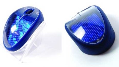
solar powered mouse

First up is the solar powered mouse. Yes you heard me right. It could save millions of batteries a year from all those wireless mice. But how practical is this product? Do we not need sunlight to charge this beast (Wait I don't sit near a window. I'm on the lower ground floor of my building. I have my hand over my mouse all day. Hmmmm)

Solar powered products are great in some instances and I think this product could be good. I know it can be a pain to remember to redock the wireless mouse at times. Although, part of me does feel like this is a bit gimmicky and simply jumping on the green bandwagon.

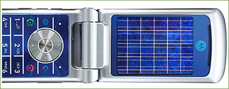
solar powered motorola phone

Now this is a great idea. Motoroloa have recently patented this solar charged mobile phone based on the fast selling Razr. Ok so this will start out as an expensive option but lots of people don't mind forking out for quality gadgets (can anyone say iPhone). And as the cost of charging the newer phones increases with a phone's complexity, this solar powered phone will be a great option. And it looks kinda cool too.

solar powered bikini

And the silly. The solar powered bikini for the woman who has it all (sat by her by the pool...and it needs charging NOW). It just looks darned uncomfortable :S

Technology made from wood

morris minor

As memories of the Morris Minor fade into our collective mushroom growing memories could it be time for a bit of a revival? Could we see a day where computers coated in plastic just seemed so passé...

wooden coated mouse

This bamboo polished mouse given to the organisers of Live Earth looks great and to be honest would look great on most Ikea beech effect wooden desks. I think this is nice, different and unusual. I'm just wondering what the scroll wheel is made from?

cardboard lined notebook

You've got the wooden mouse. How about a cardboard coated notebook? Ahem. I'm not sure about this one. I want my laptop to be able to take a few knocks and not go all soggy if a drop of water gets spilled on it. Environmentally friendly yes. Durable maybe not.

Muji's cardboard speakers

Flat packed and made from cardboard. Muji has the answer with these great little speakers. They look pretty good and the sound isn't bad. Totally portable and mostly recyclable this is a great little gift for those with a green heart. And now that Apple is going greener it will even go with your iPod nano.

Products made from gadgets

recycled keyboard earrings

As the waste mounts up from our disposed tech so some clever and industrious people are recycling some of this waste into "attractive" jewellery. Perhaps the upcoming Sex and the City movie will see the eponymous heroine sporting a 'C' on her right ear and a 'B' on her left from her recycled old G4 powerbook, perhaps even an old piece of motherboard dangling around her neck disguised as a necklace. Now if Gaultier or Westwood are onboard....

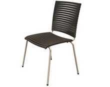
chair made from recycled playstation

Any ideas what this chair has been made from? It is in fact made from recycled Playstation cases and at £99 each is simply a bargain. But they are quite hard to come by at the moment. The reason? Not enough people are throwing away their Playstations (yet).

Going green is certainly a concern for many environmentally aware corporations. Just look at Blackle which demonstrates how much energy Google could save (135,227.251 Watt hours saved at the last count) just by using a black background. Highlighting a company's energy use is one way to instigate change. Awareness is on the increase. Having a smaller carbon footprint is becoming at the foremost of people's concerns. Recently the Lights out London campaign urged Londoner's to switch off their lights for an hour saving a huge amount of energy for the capital whilst raising awareness about these issues. It is only a matter of time that companies will truly cash in on this growing market of consumers and start fighting over their EPEAT rating.

Saturday, July 21, 2007

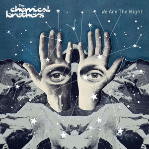
we are the night

I've had this album for a week now and I've got to say I am loving every minute of it. It is electronic heaven for me having always really liked the Chemical Brothers. They do not disappoint with this their latest album. Do it again is a floor filling, thumping and really catchy number that's already doing well in the charts. But the whole album is like an ecclectic look through someone's musical tastes. For example "The Salmon Dance" which is just bizarre in that it talks about the life of a salmon?!? and yet the song is really lively and catchy. This album works on first listen and just keeps getting better. Check it out on iTunes here

Wednesday, July 11, 2007

a rhythm of lines

It's out! The rhythm of lines microsite is finally live thanks to a LOT of hard work by the boys. This is what I was telling you to look out for after the TV ad I blogged about before. This is really cutting edge Flash work here utilizing some nifty papervision-esque 3D techniques and the speed of the Flash 9 player. Vorsprung Durch Technik this really is. You create your own rhythm of lines with this flash app to create a sculpture of ribbons that exists in a 3D space. Don't forget to enter your creation into the competition because Audi will choose the best designs to be printed out and sent to you. The way I understand this working is that you essentially have a 3 dimensional sky box which is fairly vast. The centre of the box draws you into it so you can never actually reach the edge. The ribbons are drawn dynamically based on the x,y,z co-ordinates generated by the mouse movement. The car models are created by using the co-ordinates generated in a 3D package such as Maya and then having that model outputed via an app called Collada to create an XML file that contains the co-ordinate information needed to draw that shape. Enjoy!

Monday, July 09, 2007

there's something in the water

Thanks to Jo at work for sending this cool animation round for V Water. I guess this product is new to the UK but I'm definitely used to it from my travels to the US. It is a nice product in itself but the way this is being marketed in the UK is quite interesting. They are going for that low-res hand drawn approach that is so popular these days. The cartoon style is playful, almost child-like. The story is fun. It is a good way to present V water as the product itself is basically water with a few extras thrown in. Tapping into the energy drink market would have been the easiest option but they are aiming towards a market who wants to try something new and different.

Wednesday, July 04, 2007

the dark is rising


Oh my god I could vomit with excitement. Forget The Lord of the Rings, The Wizard of Earthsea, The Lion The Witch and The Wardrobe and forget Harry Potter. This series of books is superb. Written in the 60s by Susan Cooper it is an amazing fantasy coming of age story that blew me away as a kid. It was aimed at the older more discerning teen and had me totally captivated. I don't want to give away any plot points as there is one in particular that is best left for the movie but is sure to delight. I hope they aim this above kids as in my memory it was fairly adult in theme. Definitely one of your darker fantasy novels. What is also great is that it is totally British in plot featuring and melding English folk lore into present day. I hope the inclusion of an American (surely only to appeal to the US market) will not detract. Can't wait...

Tuesday, July 03, 2007

beyond the banner

Thanks to Marc at work for this heads up. It is a good example of thinking beyond normal constraints (phew I didn't say 'outside the box'). And although this isn't technically brilliant it is a good idea and loads of fun. I won't spoil the surprise just promise you'll keep watching until the end :) It is worth it. Check it out here.

Monday, July 02, 2007

fire & water

Don't you just love it when a piece of work just jumps out and says something to you...like wow. Superb photoshop skills are in evidence here as a blend of water drops forms to take the shape of fire. It really works because you do get blue flames some times (the gas hob works especially well). It reminds me of a British print campaign out now for Bacardi where the bottle's side is exploding into water. I can't for the life of me find it on the net though. Here is the original files on the web. No mention of the artist's name. Would love to find out who is responsible and perhaps see some more of their work. Oh and if anyone can point me to the Bacardi work I would be grateful.

Sunday, June 24, 2007

photosynth demo

Photosynth has come a long way since I saw it about a year ago. This demo will make your jaw drop open in amazement. You know how when watching a sci-fi movie like Blade Runner they zoom in on an image and enlarge tiny portions of the screen? Well this demo shows this capability. Ok so we're not there quite yet in terms of being able to do that to any image because at the end of the day the resolution of an image is always a factor. If you take a picture on a mobile phone you will never be able to do much with it. But what photosynth does is postulate that of any given landmark there are enough images taken by people that are online to be able to create an interactive map of that place. So given the meta-data of images stored, say on Flickr, this application can build up a representation of that place. You can zoom in on any feature and can even fly around a virtual 3D representation of that environment.

The demo also showcased Seadragon which is a way of displaying 'vast amounts of visual data' onscreen. A really nice touch was the ability to show every page of a magazine on screen and then really quickly zoom in to a page you'd like to see with absolute clarity. Stored within corners of a page could be advertisements say of a car which again you can zoom into. But these ads can contain tiny extra images of further details so that if the person is interested they can zoom in to read that information. It's kind of like those micro dot things we used to see in old spy movies. It's a great idea and again done by Microsoft. When did Microsoft become the innovator again? Are they now the underdogs?

Saturday, June 23, 2007

LFPUG

The London Flash Platform Users Group (LFPUG) is a fantastic resource for those who work in the Flash community. They meet every month at various east london bars, which is great because it means that beer is always available, and they invite guest speakers to come along and talk all things Flash. This last talk was on 3D in Flash with two sets of speakers. First up were the legends responsible for Papervision, Carlos Ulloa and Ricardo Cabello a.k.a. Mr. Doob. Carlos kicked things off by talking about how to get started with Papervision. Ok so a 3D artist is essential for most tasks and a good knowledge of a 3D package (Maya, 3ds Max etc) is helpful. But the explanation of how to think in 3D was what got me interested. The introduction of the z axis and the concept of a sky box are all crutial in thinking outside (well actually inside) the box. Check out the papervision blog and get on the mailing list. It is actually quite easy to get started with this tool, once you have your basic 3D object, and the code not too difficult (although I'm sure it does get quite involved quite quickly).

Next up were the guys over at Special Moves. This company has been around for 7 years and specialise in creating 3D for all kinds of output with Flash being a major factor for them. We learned that there are many ways to create 3D, from simply faking a parallax effect, through to isometric games, through to fully immersive 3D environments. It was great to see some GT work being showcased. Christian Aid Week was a good example for them of a 3D model that was set isometrically and the viewer had no interaction with the actual model. They admitted that this work was extremely difficult for them in terms of nailing the animation but the end result is awesome. GT is more than likely going to be working closely with Special Moves in the near future so watch this space.

Both of these talks were extremely useful for me as most of us who use Flash will touch upon 3D in some way at some point. GT have already worked with both Special Moves and Papervision in the past. Check out a rhythm of lines which is due to go live any day now for the work done by GT using Papervision... it is going to be very cool.

get the message

I am finally getting around to reviewing this awesome piece of work by Glue London for the Royal Navy entitled get the message. It's just a really nice execution and great use of flash video. So aiming itself squarely at teens and mostly boys at that, this site invites a user to create a video postcard for a friend by selecting from a preset list of 6 videos each depicting a different Royal Navy inspirational scene. Once selected you get to pick your friend's name from another set of presets (this won't work if your friend has an obscure name). And then you get to type in a message limited to a fixed character length. The video is rendered and you can see the results in the link at the bottom of this post. Even more powerful is the ability to send it to your phone. This is a really cool feature and the results incredible. I urge you to try it. What is really cool is that the audio speaks the person's name (hence the presets) and also dynamically displays the message written. The area the message is written is on a loop of video that has camera shake for added drama. The text field follows the movement of the camera shake which is really nice. I'm guessing this is done in flash but I suspect some heavy back end work is going on as well. Any ideas on how this is achieved would be greatly appreciated....


Check out my video here.

Sunday, June 10, 2007

faithless + coke


Coke have teamed up with Faithless to create this exceptional Flash site to promote their new bottle design. In collaboration with Paranoid who are a group of international artists, Coke have come up with this gorgeous bottle design that is painted with special ink that glows in a dark room or night club. Alongside the bottle design is a delicious piece of surreal animation upon which the website is based (created by argonautenG2 from Germany). The site allows you to explore the bottle by creating your own visual poetry and create your own design by using your built in webcam, microphone, mouse and keyboard all to control the avatar who kindly throws your visual poetry onto the bottle. The site also allows you to download your own copy of the animation, has a link to the track on iTunes and even has a slick screensaver for you to wow your friends with. VERY impressive stuff indeed. Check it out here

Saturday, June 09, 2007

someecards

someecards seems to have been doing the rounds recently by the folks in the know and yes they are cute. They follow that trend of being fairly abnoxious using ideas that you wouldn't usually see on a card. Definitely made me laugh.

"You've been distant since the sexual harassment"

"Thanks for lowering your expectations of me"

"Dad, you've always been like a father to me"

:)

Friday, June 08, 2007

webby speeches

So the Webbys have just happened which is quite a big thing in the digital industry. Well to win one is quite prestigious but those in the know really don't care about winning one. Anyway it is “The Oscars of the Internet” and the really nice thing about the award ceremony is that you are only allowed to give five word speeches. And some are classic. Here are the highlights....

Artist of the Year - Beastie Boys: Can anyone fix my computer?

Lifetime Achievement - David Bowie: I only get five words? Sh*t, that was five. Four more there. That's three. Two.

Social Networking - Facebook: I'm just here for Bowie.

Blog - Cultural/Personal - TreeHugger.com: Don't shit where you eat.

The Reggie Bush Project: Finally a Bush everyone loves.

DIYNetwork.com: Now, let's get hammered.

What Is Enlightenment?: Get enlightened, or die trying.

Nick.com: Have sex, make more kids.

Philips Norelco Bodygroom: Hairy balls got me promoted.

Mindflood Seduction: Lorem ipsum dolor sit amet.

The Guardian: Please free Alan Johnston now.

eHealthInsurance: Don't go naked, get covered.

Yahoo! Real Estate: There's no place like home.

Wikitravel: No longer a lonely planet.

OpenSecrets: Fat cats need watch dogs.

CLEARIFICATION: Thanks mom: whoever you are.

Animator vs. Animation II: Get into our shorts.

Terra: The Nature of our world: Video Podcast: Green is the new black.

The Extreme Diet Coke and Mentos Experiment: 18,000,000 views. Still no dates.

Here is the full list of winners

Thursday, June 07, 2007

london olympic logo

Well much comment and criticism has been spewed over the recent London Olympics 2012 logo design. It seems us Londoner's are a bunch of design conscious people. Having been shown our garish and boxey design, made by Wolff Olins, we are all in arms. I totally agree that this design is a disaster. The colour is horrid. The shapes are unrecognizable (I only clicked yesterday that it is supposed to spell 2012). The text looks like Comic Sans. And in general it looks like a 12 year old has designed it. Actually, that wouldn't be a bad thing. They wanted this design to appeal to the youth market so why not get their input and design ideas. Clearly this logo has suffered a design by committee with several groups vetoing other ideas. Some have said this logo looks like the Nazi swastika. Others have said it looks like Lisa Simpson performing a sex act. What is clear is that Joe Public hates this logo. A recent showing of the animated version had to be removed as it caused epilepsy in 18 people. People are so incensed that they are even sending in their own ideas and some of them are actually really good. Do you feel strongly about this logo? Have your say at the online petition.

Tuesday, June 05, 2007

gondry for hp

Oh I love Michel Gondry and he loves experimenting with film as is shown in this nice ad for HP photosmart printers. It reminds me of that great HP ad "out of the picture" of which I can only find the dutch version (below). It's that one with the picture frames going over the guys head. A simple effect to do in After Effects but effective none-the-less. It is kinda cool for HP to align themselves with all these trendy people as they have done for this campaign with famous singers and snow boarders also in the line up. They want to show a variety of ways their product can be used to invent. The Gondry ad just shows again how this eccentric French man thinks and dreams and how this is all realised into something tangible. Nice....


Monday, June 04, 2007

iPhone home

uuuuuggggggg mmmmmmmmmm can't make words too busy droooooling

The iPhone gets its release date today. June 29th for all those lucky enough to live in the States and can use AT&T. Presumably we will have to wait a bit here in the UK which will hopefully mean a bigger hard drive and 3G (please put in a better camera Steve). I can't wait. Ha ha

Check out the new US ads for the iPhone below...


Sunday, June 03, 2007

d5 jobs & gates history

Ok uber geek alert!!! This interview is one of the rare appearances that Steve Jobs and Bill Gates have made together over the years and occurred at this years D5 conference (think G8 but digital). These two, surprisingly charismatic, figures chat comfortably together. But what is really special is to discover some genuine history and how it all began in the computing world. Hi I'm a Mac and I'm a PC :)

Saturday, June 02, 2007

montana meth project

This series of anti-crystal meth ads from Montana really hit home. The dichotomy between what is being said and what is being watched is really effective. Crystal meth is one of the most harmful drugs out there and is seriously ruining the lives of some young people out there. This campaign is hopefully going toward stopping some of that harm. My only real worry is that this ad is preaching to the converted. It seems that possibly this set of ads is talking to parents and kids to show them how badly drugs can mess up their lives, it is not actually talking to the kids who are currently using. However, if the message reaches just a few of those kids who may be tempted then it is a success.


Thursday, May 31, 2007

surface

So it has arrived. This is a landmark in the way we engineer our computing environments and this will set the bench mark for things to come. And it comes from Microsoft. Yes they beat Apple to it. It is SURFACE. It's a multi-touch enabled coffee table that allows you to drop your digital camera onto the surface and it automatically downloads your images for viewing on the table. You can then resize, zoom and crop your images. Even upload them to another device. It is amazing. The drawbacks to this are that it is quite impractical relying on mirrors, cameras and projectors to work. Unlike the multi-touch device, iPhone, which will be accessible to the masses and will probably do really well. Madonna has been given a surface. B**ch. Helsinki has a tourist info wall. I want one. It would look great in my flat. But you can be sure you'll have to use a coaster for your drink.

Wednesday, May 30, 2007

i believe in harvey dent too


Check out this cool viral site for the upcoming Batman: Dark Knight movie which is still in production. Ok so it looks like an error page. Wrong! See if you can highlight the text. Ha ha! But that's not it either. Check this out. Copy and paste the whole lot into a text editor and then use the find and replace function (usually under the edit function) to replace all the "Ha"s with just a blank space. To make the secret code even more obvious. Find all the "spaces" and replace them with simply nothing and the coded message should be really easy to read.

Catch up lady has lots of news around other campaigns that have been witnessed in and around the LA area for the new Batman movie. How excited am I. I absolutely love this kind of marketing as it gives an edge over traditional advertising and it appeals to it's target audience. Can anyone say Annie's secret decoder ring? (watch Woody Allen's Radio Days if you have no idea what I'm going on about).

Monday, May 28, 2007

rhythm of lines

So this is the latest Audi A5 car ad from BBH. This is a really nice idea but sadly the execution is a little lacking I feel. What I like about this ad is the movement of the lines to the music. It feels like ribbon floating through space. The lines that make up various sides of the car form freely, if a little obviously, to the flow of the music. I am not sure of the use of colours here though. A rough, early cut I saw of this ad had the ribbons purely in red, a deep red, which seemed to work a bit better. Also the end resolve of the ribbons into text just doesn't work for me. It looks lazy and childlike. And if you see the full version of the ad (at least the full UK version) over at the Audi site you will see that the ad ends on the car. Yes an actual photograph of the car, thus nullifying all the previous work of the ad. A car company like Audi should be confident enough in their brand by now that they need not show the car at all (see BMW) in their ads. The decision to have the car at the end is poor in my mind. This ad should serve to generate curiosity and interest in their product.

Watch this space for the imminent release of the gt microsite for the A5. From what I have seen and heard it is going to be awesome.

Sunday, May 27, 2007

veneno

Veneno are the LA based team that created the incredible visuals for the last Madonna tour 'Confessions'. The song that really stood out for me visually was Forbidden Love, featured below, where blood cells float about on screen as Madonna sings. Two men stand to do an interpretive dance one bearing the symbol of Islam and the other the star of David. Their hands and wrists writhe together as they try to hold each other yet barely for a second manage it as the other slides away continually. Momentarilly they hug before resuming their twisted slippery hand tussle. Centre stage is Madonna with a huge Christian cross adourned in mirrors and the blood cell visuals starting to take shapes as symbols of religion behind. The message in forbidden love is that we are all one, made up of the same material, yet we fight for some perceived deity. Crossing each other we fight our brothers and sisters whom we should be loving. Mads really hit the nail on the head for me with this one. And although I don't necessarily agree with all her beliefs this one holds true with me. And I love the visuals. Check out more from Veneno on their homepage.

Take a second to vote on your favourite city break (right)

Saturday, May 26, 2007

try drugs

This educational site about the dangers of drug use is very clever. Titled 'try drugs' the site is split into three areas exploring marijuana, cocaine and heroin effects. But the way the site works is to present you with a seemingly static page featuring an animation, some copy and a piece of music but turn things on their head by hijacking the controls. So for the marijuana section your cursor is sluggish and the copy blurred (until you rollover it) and at the end a pop-up warning window appears from the Norwegian crime unit saying that illegal activity has occurred with your IP address and country. For the cocaine section the cursor is hyper and over responsive and keeps taking lines of coke making the screen flash brightly with an email pop-up window saying that illegal activity has been spotted on this machine and the email getting sent to the authorities (although not for real obviously). And finally the heroin section is surreal with the copy exploding inwards and being generally illegible and lots of pop-up internet pages dealing with death and bankrupcy appearing. It is a clever way to highlight the effects of drugs on the user as for those who have never tried the drug you can get a feeling of what it is like to be on them.

Don't forget to vote for your favourite city break (right column)...

Friday, May 25, 2007

stop go tokyo

So am now back in London after an excellent time in NYC. But I'm still in that big city state of mind so I thought I'd share this dramatic piece of time-lapse video exploring the Tokyo cityscape. Set to a piece of music each scene matches perfectly to the pace of the sounds. A great reflection of an incredible city, this video really illustrates the hustle and bustle of the urban expanse.

I am tired and jet-lagged I think it's back to bed for me (yawn)....

Thursday, May 24, 2007

nyc


You've gotta love New York. Here's our evening from last night.

1. Grabbed a slice of pizza from one of those great New York pizzerias just round the corner from the hotel

2. Met Jonathan and his friends at the Hudson Hotel. OMG the place is amazing. Intricately designed to incredible detail. From the stark exterior which we walked past. To the beautiful 'chartreuse' staircase. They have a beautiful library with thousands of books on the high walls overlooking pool tables with huge semi-sphere lights hanging over. The chandelier by reception had tens of holograms of light bulbs. The bathrooms were immaculate in white with gothic mirrors adourning the walls. We sat outside on their terrace being dwarfed by huge skyscrapers either side of us.

3. Then off to some random margarita place for nachos etc.

4. Then to a bar called Vlada where the uber cool New York urbanites hang out. We were entertained by the lovely Edie who sang and told us tales. Then bought us an Edietini at the bar afterwards.

5. Followed by an unnecessary nightcap at BARacuda.

Only in New York!!!

Vote for your favourite city break (right) and I'll see you back in London tomorrow ;)

Wednesday, May 23, 2007

the big apple

You gotta love the portions that New Yorkers serve for breakfast and lunch. We found this awesome diner on 33rd and 9th which is totally authentic. In the UK this would be a themed restaurant but this was the real deal. Complete with counter with cake, moody waitresses and chintzy Americana on the walls. Brilliant. I wandered by myself yesterday as Michael had work to finish up and so got to finally see the Apple store cube on 5th avenue and the Abercrombie and Fitch store. The glass cube that is the Apple store is just incredible. It is a feat of engineering and is perfectly designed. Glass and steel cube sides welcome you to the store below as you wind down a glass staircase or take the glass tube elevator. A&F was lots of fun too set on four floors and very lush inside. It is really dark there and the music is pumping. The boys and girls who work there are unfeasably stunning and the clothes are...well they are abercrombie of course.

At night Jonathan took us to Bombay Talkie. We have been before but I don't know the food just seemed even better this time. It is Indian classics done in a contemporary way. The style of the restaurant is far from your usual Indian spot. Their martinis are divine and the food is so incredibly tasty. Definitely worth a look if you are in the city.

Check out my latest photoset here

Tuesday, May 22, 2007

In a New York state of mind

It's amazing the things that you see at night. This bit of graffiti art was drawn on the metal shields that get pulled down in front of a shop window. It was right by our hotel but you could only see it at night. I really liked it. The kid is licking his PSP like it is a lollypop. And the eyes are spaced out like he is high. Kewl.

Had a blast yesterday. Shopping all afternoon after the stationary show, then we were off to musical monday's at Splash. I know, it sounds like a nightmare but was actually loads of fun. This song by Jennifer Holiday from the original Dreamgirls played us out :)

Monday, May 21, 2007

New York city

So I'm up at the crack of dawn here being still on UK time. Checked into our hotel yesterday afternoon after a lovely time at Jonathan and Nick's apartment in Brooklyn. We are at the Chelsea Star hotel in their Wizard of Oz themed room! How gay. The rooms are tiny but then again this is New York. Spent the morning and first part of the afternoon at the National Stationery show which is the reason we are here. Michael needs to meet some people and potentially buy and sell Cath Tate cards there. It's great because I am put to work trawling the stands posing as a buyer and have found some really lovely designs that could be used. And some of the artists I have met there are brilliant. The place is huge though so it's a bit daunting. The afternoon was spent browsing a few shops and seeing what we may or may not buy. God the exchange is so good at the moment for us Brits. It's like one big two for one sale :)

Anyway here's my photoset from the first day.

Sunday, May 20, 2007

new york, new york

So this is coming at you from New York, New York. Arrived yesterday after a hellish day of travelling. The UK part was ok despite overestimating how long it would take to get there and arriving a fair bit early. So we were travelling Air India which was unto itself an experience. It seemed that the ground control were used to certain behaviours and so as they announced that boarding was to be done 'strictly' by seat number and then EVERYONE getting up to board, totally ignoring what had just been said, the staff took charge. Once we got on the plane, which incidently was a huge double decker of a plane, we got settled into our seat. Our movie selection looked set to be a kid's movie starring Abigail Breslin and some Bollywood movies. Fun. But the only problem was that our projector only showed the first line of the three lines of subtitles. So some educated guessing was in order! Food was actually quite yummy and we both had an Indian chicken curry (although it was obviously just a chicken curry when ordering). And the service was great. Our middle-aged gent of a steward was the pinnacle of polite as he handed out drinks with a white glove worn. The problems occurred when our lovely co-companions started getting sick. One woman lost bowel control and another lost her lunch. And feeding everyone a curry for lunch produces some funky smells about half an hour later. Nice. The people also totally ignored all requests by the cabin crew so we saw several people going to the loo while just about to land and everyone undoing their belts immediately after touch down and seeing to their bags.

But the worst part of the journey had to be our treatment by staff at JFK airport. We arrived into the new wing at the airport already an hour late having taken off late to face a queue of around five hundred people going through customs. The only problem was that they had 3 staff on to deal with visitors and 3 for citizens: no queue on one side and hundreds on the other. Oh and the queue took forever as each person is checked in VERY thoroughly. Eventually, after an hour and a half, we reached the front of the queue and noticed about 2000 people now behind us. And so we reached the lovely customs official WANG. I approached him with Michael.

WANG "Are you related?"

ME "No we're travelling together"

WANG "Go and stand over there" (nasty tone)

The US Visit scheme pledges for their staff to greet people and welcome them to the country, to deal with people in a friendly and courteous manner and to hear the requests and questions of all. Well WANG didn't even look at me. He was rude and unfriendly. Oh I didn't mention but we were first in line for his queue as he started work. I'm not joking when I say he spent 10 minutes cleaning his screen, obviously knowing it was pissing off the line of people who were all watching him. Talk about power trip. So I had my biometrics taken (both index fingers scanned and a photo taken) and finally got through to collect my bags. All in all I was tired, grumpy and dishevelled. Both of us vowed this was our last trip to the USofA after the harsh reception we received.

Left our flat at 9.40 UK time. Arrived at Jonathan and Nick's apartment at 8.00 pm US time. 15 hours travel time.

Saturday, May 19, 2007

wwf

This is truely a remarkable and inspired billboard ad from the World Wildlife Fund. Using the sun and a specially designed screen, the shadow cast on the ad creates the illusion of the seas rising over the course of the day. This stop-motion video shows how the ad looks over time. This is genius and just shows how if you think a little laterally you can produce stuff of meaning for the real world. The link takes you to a Save Our Climate microsite.

Wednesday, May 16, 2007

beats shadow puppets

I was emailed these very cool pictures today at work and as you know I love shadow puppets. But this was an email of 5 pictures so how am I supposed to share these gems with you. Yes I could publish a small thumbnail to my blog but I really wanted to share the files with you. Oh I have no idea who made them and if I am infringing on anyones copyright I apologise and will take them down. If I knew who did them I would just link to their site. But here's an idea. Box.net make a widget from which you can share files with each other. So you get a great preview of what I am going on about in the form of an image viewer. How cool is that. Check out my other half's way of sharing music over at his blog My Stuff and Cr*p

christian aid week

So it's Christian Aid Week this week and as they are one of our clients at GT we have produced a really nice microsite for them. A really cool idea taking the metaphor of the envelope and showing exactly what your small donation can mean. Visually realized with a cool 3D model and some nice animation all lead to a very effective little campaign. Nice work guys! Oh and please give generously if you can. It's a GREAT cause ;) Check out the microsite

Tuesday, May 15, 2007

ray (should be) ban(ned)

The 80's are back and so it would seem is Ray Ban here with this viral video. Watch it first and we'll discuss in a minute.

Ok so this went round the agency today and although it did get fairly widely slated it is clearly quite clever. I suppose there are people out there who won't realize that it is all done in After Effects or some such tool and to those it works as a good viral video, one you really do want to send round to all your mates. To the more savvy viewer they will realize that this is just a shameless promo piece for Ray Ban featuring two obnoxious guys. But it is still a good video with a good concept and one that everyone wants to look at even if just to see how it was done. And if you notice on the car window the words "Never Hide"... type this into google and the top hit is the Ray Ban website. Clever!

Sunday, May 13, 2007

poll daddy

Who's your daddy? Just found this cool little widget for all you bloggers call Poll Daddy. Create your own poll and host it on your site. This is a great and simple way to find out what your readers are thinking as it is incredibly difficult to get people to comment on your blog (for me at least). So I figure this is a simple way for people to cast their thoughts. So first up: what is your favourite messenger client. For me it is Adium which is a multi-client app for the mac allowing me to include people from all the major messenger programs. That way I only have one window open to keep in touch with all my friends. Oh and it also features tabbed chat windows which is lovely. Check out the poll here

Saturday, May 12, 2007

normann

Oh I just love the pretty things in life, this being one of them. From the Danish design house that is Normann comes this gorgeous washing up bowl and wooden brush which I happened to find in a very cool kitchen shop in Eastbourne today. Looking through their site you can see that they make some really lovely and inventive products with that typical Scandinavian simplicity. Oh but it's yellow too and makes the sink look so much prettier.

Thursday, May 10, 2007

fedex slingshot

I saw this banner ad for fedex titled slingshot and I had to share. The reason I like it is because it surprises you a little by being able to pull the package outside of the ad. The way this is done is for the advertiser to buy a space bigger than the area that the ad looks like. Within flash you then create an invisible background so that the page beneath will show through. It then appears that the fedex package pulls beyond the confines of the ad. It is an effect done many times before but where this ad works is in its simplicity. For best results view WITH sound. Oh and if you are in the industry or working in flash you should add banner blog to your list of bookmarks because at some point you will probably have to make a banner and this is an invaluable resource.

Monday, May 07, 2007

latte art

There is nothing better than a good cup of coffee to wake you up in the morning. And the art of making good coffee is one that coffee drinkers take seriously. I'm sorry but blasting some milk with steam and pouring it on top of espresso and serving it in cardboard does nothing for me. When I lived in Bermuda they had a great coffee house called Rock Island where they roasted their own beans and brought in speciality coffee from around the world. This is true java. Filtered coffee at its best. I so don't get the new found, British affection for milky frothy drinks. Ok so good espresso is great and a proper latte is also very good. But rarely is it the case that coffee houses here make good ones of either. If you are a true coffee fan check out this site where they show you not only how to create awesome designs in your coffee but more importantly how to make good java.